August '10
From design to bar:
Antidote chocolate launched.
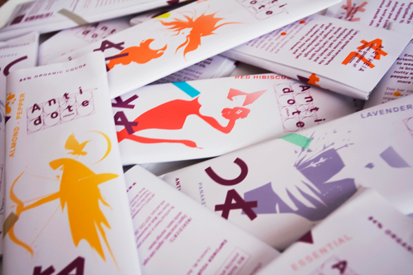
It's been a while since the last Red Letter, but here we are again with exciting news: the launch of Antidote chocolate in five distinctive flavors for emotional turbulence and heart blues.
We branded and designed all stages of the Antidote chocolate line: Dark chocolate bars, each named after a Greek goddess with the spirit and potency to relieve body, mind and soul. Antidote bars consist of 50% raw and 50% roasted organic cocoa delivering a full aroma profile and potent health benefits. Empower your inner goddess!
When creating a product, sustainability is an imperative now. General definitions of sustainability refer to the "three pillars" of social, environmental and economic sustainability. For us and this project, it also meant incorporating the five senses into the concept of resilient design. We developed Antidote to smell good, to look appealing, to sound good - that perfect chocolate crack, to please your palate while delivering nutrients and antioxidants and to make you feel invigorated.
We gained a wealth of experience in the process of taking a product from conception, formulation and production to market. For more info on the brand story please visit: www.tripplered.com/portfolio/ and for more on the chocolate please visit: www.antidotechoco.com
Testers say: "OMG!!!"
So far available at Garden of Eden, Zabar's, Amish Market and Gracefully in Manhattan, Tops in Williamsburg and Food Cellar in LIC.
Have a splash of a summer and let us know what you think and what you are up to!
Greetings,
Red R. Thalhammer
Antidote chocolate launched.
It's been a while since the last Red Letter, but here we are again with exciting news: the launch of Antidote chocolate in five distinctive flavors for emotional turbulence and heart blues.
We branded and designed all stages of the Antidote chocolate line: Dark chocolate bars, each named after a Greek goddess with the spirit and potency to relieve body, mind and soul. Antidote bars consist of 50% raw and 50% roasted organic cocoa delivering a full aroma profile and potent health benefits. Empower your inner goddess!
When creating a product, sustainability is an imperative now. General definitions of sustainability refer to the "three pillars" of social, environmental and economic sustainability. For us and this project, it also meant incorporating the five senses into the concept of resilient design. We developed Antidote to smell good, to look appealing, to sound good - that perfect chocolate crack, to please your palate while delivering nutrients and antioxidants and to make you feel invigorated.
We gained a wealth of experience in the process of taking a product from conception, formulation and production to market. For more info on the brand story please visit: www.tripplered.com/portfolio/ and for more on the chocolate please visit: www.antidotechoco.com
Testers say: "OMG!!!"
So far available at Garden of Eden, Zabar's, Amish Market and Gracefully in Manhattan, Tops in Williamsburg and Food Cellar in LIC.
Have a splash of a summer and let us know what you think and what you are up to!
Greetings,
Red R. Thalhammer
-----------------------------------------------------------------------------
January '10
 Wishing you a sensational & resilient 2010!
This year we are very inspired by the idea of resilience which we've incorporated into the Tripple Red brand design process. It organically blends with our "Red Formula" of relevance, essence and differentiation.
The concept of resilience originally came from the ecological sciences in describing how some organisms handle shock better than others. The theory goes the more complex (less resilient) a system, the more vulnerable it is and less likely to recover when faced with setbacks or challenges. It's an inspiring evolutionary concept which can be applied to and drive a variety of endeavors - with long-term solutions. For example, in architecture, resilience can mean building energy-efficient homes. In a community, it might mean thinking locally rather than globally and supporting the development of urban food sources and roof gardening.
How does resilience thinking apply to retail product branding and ideation? Externally, as a presentation of unique streamlined concepts, and internally, as a goal of becoming more flexible, purposeful and skilled in our approach to merging design and business. At Tripple Red, we are working on a project right now - a new chocolate brand to be introduced to the mass mark in the spring - in which we began by rethinking the consumer's relationship to a candy bar to tap into a deeper connection between the user and the end product. Rather than plucking ideas from focus groups we delved in the anthropological and medicinal connections to craft all stages of the brand from the product name and quality to flavors and the marketing strategy. Essentially it is about re-powering our products and services to make them more real than ever. Because even a small, everyday product and its packaging affects our well-being, perception and emotion.
* If interested in reading more on ecological science and resilience, I recommend Resilience Thinking: Sustaining Ecosystems and People in a Changing by Brian Walker and David Salt.
-----------------------------------------------------------------------------
October '09
 The logic and magic of branding & packaging design
When developing a budget for bringing a new product to market, many companies overlook one of the most prominent, cost-effective elements motivating consumer decision-making. Design.
For all the money and time spent collecting and analyzing market research, the value and efficacy of the data are only as great as the product's success with its target audience. Without appropriate creative execution - the look & feel, appeal, spirit - that turns the "logic" into "magic," this information alone won't connect consumers to a brand. Because while market research reveals what consumers consciously want, products work best when they offer an element of discovery for the consumer. Design is crucial to creating interest, developing aspiration and delivering surprise.
Tripple Red believes in business strategies that intertwine creativity and foresight. We translate market research and brand messaging into a visual experience by anticipating what will compel consumers to action in the future - a subtle approach that involves zeitgeist, intuition, imagination and insight into human emotion.
In the end, design is a problem-solving process. As such, it pays to consider it key to your brand's success and invest in it accordingly.
On a related note, I recommend Daniel H. Pink's best-selling book "A Whole New Mind," in which he addresses the power of creativity and why right-brainers will rule the future.
Have a nice autumn and let me know about your next project!
Warm regards,
Red
-----------------------------------------------------------------------------
September '09
New product packaging = No rules
Last month we focused on reinvigorating established brands, but what are the design rules and parameters for new brands? After all, they will have to vie for market share against well-known offerings. Luckily for newcomers, when it comes to product packaging, anything goes. Innovation and creativity are the best marketing strategies for standing out in a crowd. And increasingly, original design is seen as synonymous with desirable products.
Of course, branding for consumer goods is always complex. Together with packaging, it stands as the biggest marketing tool and represents a critical investment, but if done well, you need only budget for creative concepting once every 10 years.
Here are two projects we did in the past few months that exemplify the no-rules approach to product branding and packaging.
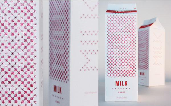
Have you ever wondered why dairy product packaging often looks so unappealing? While everyday consumer goods are a necessity, that doesn't mean the packaging has to be mundane. Here, we focused on the purity of milk - just a single ingredient - and its connection to the customer as something fresh, enriching and gratifying on the shelf, as well as on the kitchen table! Printed in a single color it also passes the environmentally friendly test. The red-and-white pattern is reminiscent of a stitched, antique tablecloth, but the magic comes into play when the design element transforms into MILK when read from afar.
Our MILK design was selected 1)for Luerzer's Archive - 200 Best Packaging Designers (publishing date in November 2009) and 2)for the world's #1 packaging design site: http://www.thedieline.com/blog/2009/08/milk.html#more
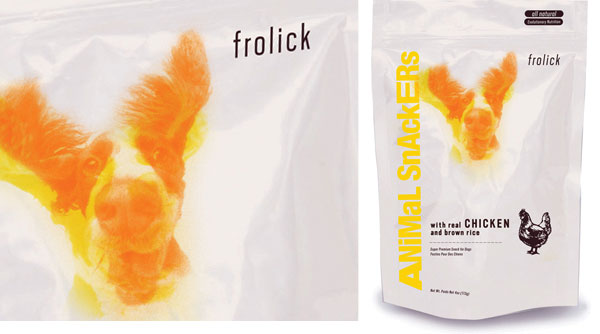
Packaging for consumer goods so often is a patchwork of communication and attributes. Remember though, you can only be known for one thing so all elements should work together to focus on the essence - whatever that may be - of your brand. In developing the brand elements for this high-end, all-natural dog food from an innovative company, we focused on the joy in the special relationship between a dog and its owner. The overlapping dog-in-motion sequence is part of the logo and the key brand element that translates joyfulness, freshness and energy while making the brand very original next to competitors. The stamp of the whole chicken adds wit and communicates honest quality.
Last month we focused on reinvigorating established brands, but what are the design rules and parameters for new brands? After all, they will have to vie for market share against well-known offerings. Luckily for newcomers, when it comes to product packaging, anything goes. Innovation and creativity are the best marketing strategies for standing out in a crowd. And increasingly, original design is seen as synonymous with desirable products.
Of course, branding for consumer goods is always complex. Together with packaging, it stands as the biggest marketing tool and represents a critical investment, but if done well, you need only budget for creative concepting once every 10 years.
Here are two projects we did in the past few months that exemplify the no-rules approach to product branding and packaging.
Have you ever wondered why dairy product packaging often looks so unappealing? While everyday consumer goods are a necessity, that doesn't mean the packaging has to be mundane. Here, we focused on the purity of milk - just a single ingredient - and its connection to the customer as something fresh, enriching and gratifying on the shelf, as well as on the kitchen table! Printed in a single color it also passes the environmentally friendly test. The red-and-white pattern is reminiscent of a stitched, antique tablecloth, but the magic comes into play when the design element transforms into MILK when read from afar.
Our MILK design was selected 1)for Luerzer's Archive - 200 Best Packaging Designers (publishing date in November 2009) and 2)for the world's #1 packaging design site: http://www.thedieline.com/blog/2009/08/milk.html#more
Packaging for consumer goods so often is a patchwork of communication and attributes. Remember though, you can only be known for one thing so all elements should work together to focus on the essence - whatever that may be - of your brand. In developing the brand elements for this high-end, all-natural dog food from an innovative company, we focused on the joy in the special relationship between a dog and its owner. The overlapping dog-in-motion sequence is part of the logo and the key brand element that translates joyfulness, freshness and energy while making the brand very original next to competitors. The stamp of the whole chicken adds wit and communicates honest quality.
-----------------------------------------------------------------------------
August '09
How to update a historic brand
Redesigning a historic brand to be up-to-date poses unique challenges. Effectively merging tradition and innovation is one critical component to success. One of our favorite companies to imagine a redesign for is Lindt and we took the liberty of giving its packaging a modern twist. The upgrade we envision for the notable Lindor line follows the Tripple RED formula of delivering relevance, essence and differenciation in one exceptional concept and is as a perfect example of how to revitalize a traditional brand.
- Essence: Our strategy plays with concepts of desire and seduction. To that point we visualized the luscious taste of Lindor truffles through a single rose in full bloom. The exquisite perfection of the rose, a classic symbol, also suggests the refined art of chocolate making and the more than 160 years of passion for Lindt products.
- Differentiation: The design concept is unique and clearly differentiates itself from its competitors through the solid color per flavor and its exuberant spirit through the imagery.
- Relevance: The color palette is refined for our zeitgeist as the aesthetics match a contemporary lifestyle. The sans serif font choice complements the Lindt logo and infuses freshness. The rose is a nod to the floral chain on the current packaging, but the stylistic treatment of the image carries the brand into the 21st century. Last but not least, beauty plays a bigger role for consumers than ever and is a proxy for quality.
Lindt is a trademark of Lindt & Spruengli AG.
As per request of Lindt we did not include their logo in the image.
-----------------------------------------------------------------------------