01
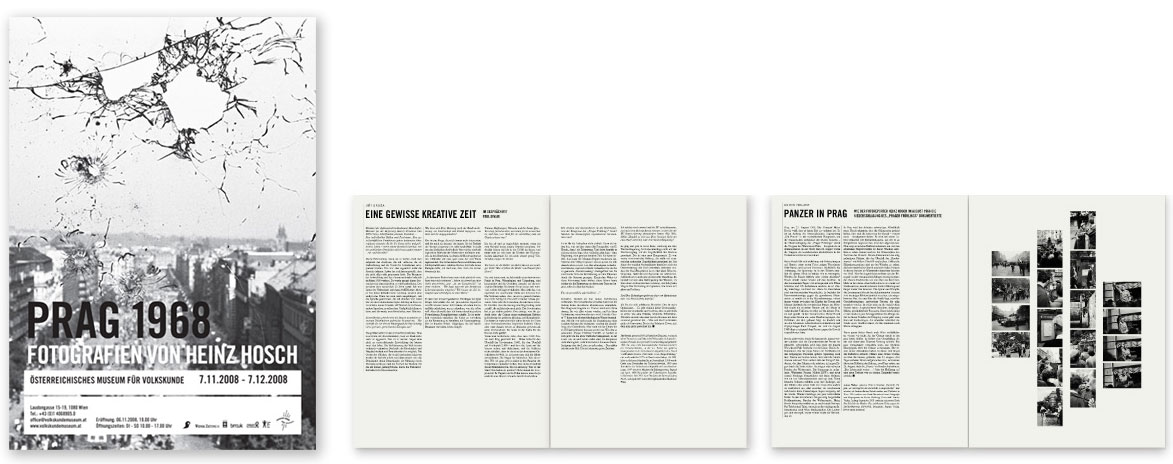
Poster & catalogue printed on newsprint
Thirty-two-page newspaper and catalogue that documents the 1968 invasion of Prague 40 years later with photographs by Heinz Hosch. Layout of poster and catalogue for the exhibition at the Museum fuer Volkskunde in Vienna (curated by Paul Divjak & Matthias Beitl). The catalogue also appeared as a supplement to the Austrian paper Wiener Zeitung. Tripple Red also designed roll-up display, banner and postcards for this exhibition.
02
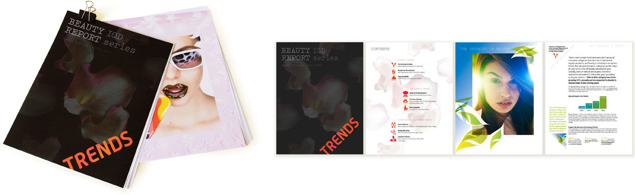
identity & report design / trends edition
The Beauty IOD Report series is a collection of industry insight briefings that were concisely edited and visually formatted to suit the needs of the time-constricted beauty executive. Each report gives a quick, easily digestible and expertly edited view of a topic to keep informed with the least amount of time and effort. Tripple Red designed this 31-page report with photographs of Andrew Vukosav. As the first of a series it is meant to inspire and to comprehend the information quickly. The first issue, the Trends Edition, takes a fresh look at the trends and demographics energizing the beauty industry today.
03
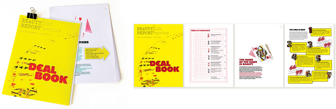
Report design / deal book edition
The Deal Book edition gives a comprehensive overview of the current climate for raising capital for beauty companies: the driving factors and players, the brands that are being funded, and the valuations they are receiving. For the overall visual concept Tripple Red used playing cards as metaphor for the game to play and deals to make in this field. The imagery of the cards adds depth to the report while aiding the presentation of information and delivering a visual experience.
04
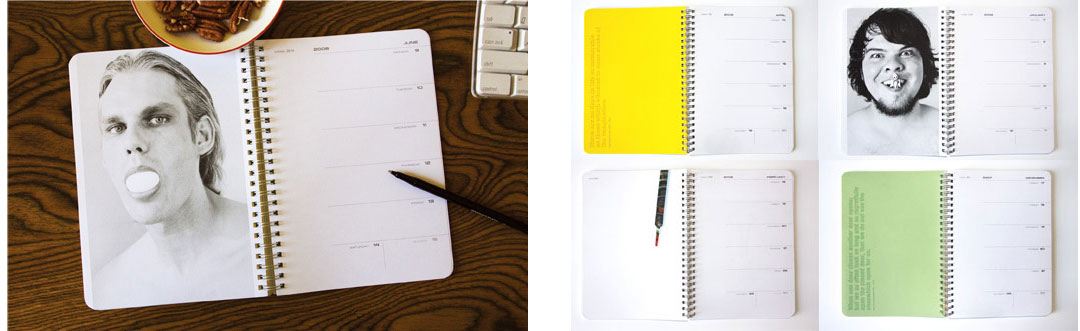
Logo & weekly calendar for student promotion
Identity creation for a student platform division under its parent company W&H Dentalwerk. The logo and promotional material had to fit into the new WH identity. The type and overall visual style is edgier and fresh faced to connect with the younger generation but still creates a synergy with the parent company. This year Tripple Red also created another student calender for WH dentalcampus designed to inspire throughout the year. It includes photographs, famous quotes, seasonal related illustrations and enough space for students to jot thoughts and notes.
05
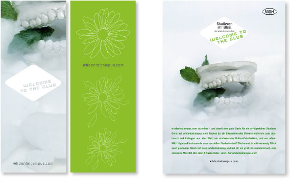
Student promotion
Tripple Red was asked to create the launching campaign for whdentalcampus.com, a student platform of W&H Dentalwerk. We photographed the plaster teeth as key visual to create ultimate impact for this new platform. Applications included, poster, roll-up display, ads, coasters and more.
06
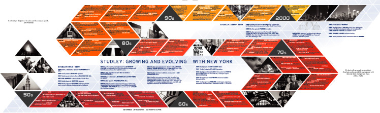
Eight-page advertorial for the New York Book
To mark its 50th anniversary, Studley wanted to showcase the past half century in New York in addition to the companys history and growth in a compelling way. Tripple Red visualized one of the chronological timelines within an oversized S and designed around the initial of this established real estate firm.